
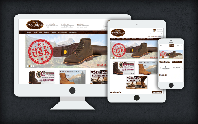
Mountain Media has just added “responsive design” capability to our e-commerce platform. Our first client to launch on this new module is Family Footwear Center, a company that sells Dansko shoes, Chippewa and other workboots and footwear that are made in America.
Responsive design is a technique for building websites that incorporates standard javascript and CSS to make it so a site can function on the desktop, tablet, and smart phone using identical code. The site responds to each screen size differently, providing a user experience that is tailored to each device.
According to a piece on internetretailer.com, a full one-third of monthly unique visitors shop only on mobile devices. On Target.com, the No. 4 online shopping destination, that number is 43%. These are shoppers that use only mobile. If you add the users that use desktop in addition to their mobile and tablet devices, that number rises to upwards of 60%, according to Mountain Media’s research.
One of the main benefits of this approach to supporting the myriad devices users use to access the web is that site administrators do not need to manage multiple catalogs. This helps keep site maintenance costs down. It also makes it so URLs for all screens are identical, making it easier for users to share links and simpler for SEO professionals to avoid the dreaded duplicate content issues that can hurt a site’s Google rankings when trying to manage serving the same content from different URLs.
Responsive design is Google’s recommended method of serving content to multiple devices. Here is a link to a piece on Google’s developer site that explains some of the details: https://developers.google.com/webmasters/smartphone-sites/details.
Mountain Media has several other responsive design websites in development. We expect to have several launches in the coming weeks and look forward to the increase in mobile and tablet conversion our clients will enjoy.
