
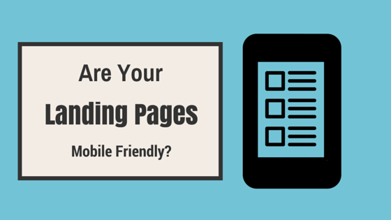
With us now more than a month into Google’s “Mobile-Friendly” update the writing is clearly on the wall to make sure your customers can reach your content anytime, anywhere. Just to give you an idea how important it is to make sure your landing pages are mobile friendly, last year, eMarketer did a study predicting that smartphone usage was going to break the 2 billion mark. Additionally, earlier this month, Google released a statement saying that mobile has surpassed desktop usage for search. So with that in mind we’ve put together 10 of the best top practices you should consider when updating your landing pages to meet your audience’s mobile needs.
Start Here
Building a mobile site from the ground up is pricey and takes up a lot of time. The best way to get started to see if you need a mobile solution is by tracking your analytics and finding your customer’s pain points and see where the drops in conversion on your website are. Once you’ve found these points, you’ll know where to start focusing your efforts. Two of the key things you should keep an eye on when tracking your mobile conversions are buying patterns and traffic.
Short and Sweet
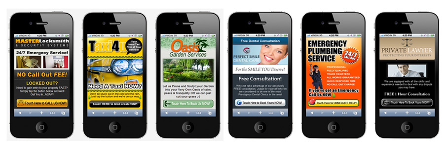
When designing your mobile landing page, you’re going to have a lot less room to work with than you get with desktop pages. Headlines are going to need to be short, I mean really short. Consumers are more fickle than ever as well, don’t even try to use a click-bait style title (“This happened, but what happened next brought me to tears”) or you’ll have more bounces than a trampoline in the summer time. Four words or less is what you want to aim for.
Organization is Key
When designing how the content will sit on the page, make sure your call-to-action is instantly visible. You have to see the page from the customer’s perspective, would you spend minutes at a time trying to pinch and scroll around a page to try and find something? Neither will your customers. One good method to try when condensing your material for your landing page, is “vertical chunking.” Think about how you can describe what you’re offering in 3-4 sentences.
White Spaces Are Friends, Not Wasteful
I know I’m spinning a line from Finding Nemo here, but the concept sticks. You must resist the urge to fill every pixel of white space on your pages with imagery or text. If you try to do this, you’ll have so much going on that the customer will get confused and lost on what they’re trying to do and will probably end up with them leaving. If you are going to use a template during the design of the landing page, remember – white space is your friend, not waste.
Time Is Money
On mobile, you only have seconds to pitch what you’re offering to your customers, and I mean that literally. When it comes to mobile, speed is everything. I know I’m preaching to the choir where this is concerned, but it can’t be repeated enough, the longer your customers have to wait for a page to load, the more likely they are to leave. When coding for a mobile landing page, try to use streamline technologies like HTML5 and jQuery, these will help improve your page load times. Additionally, keep the number of HTTP requests to a minimum, this will help further improve your page’s load time. Lastly, remember not all mobile connections are the same. Some may be using Wi-Fi while others might be on a 3G or 4G connection. Aim to design the page to load quickly on the worst of connections and they’ll be like lightning on the faster ones.
What other tips and tricks do you have for building the best mobile landing pages. Let us know in the comments below! Want help getting one built for your business? Our marketers are inbound certified and can help you get your landing pages off the ground! Shoot us an email or give us a call!
